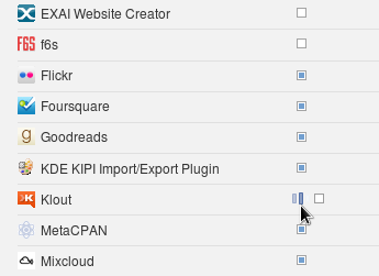
Here's a small but very visible UI bug in Facebook. While selecting for which applications to receive or not notifications there is a small progress bar image that appears left of the checkbox element. The trouble is this image displaces the checkbox and it appears to float right and left during the AJAX call. This is annoying.
There's an easy fix - either fix the progress image and checkbox positions so they don't move or place the image to the right.
In my practice these types of bugs are common. I usually classify them with High priority, because they tend to annoy the user and generate support calls or just look unprofessional.
Comments !