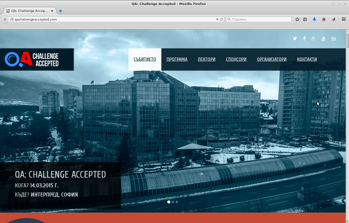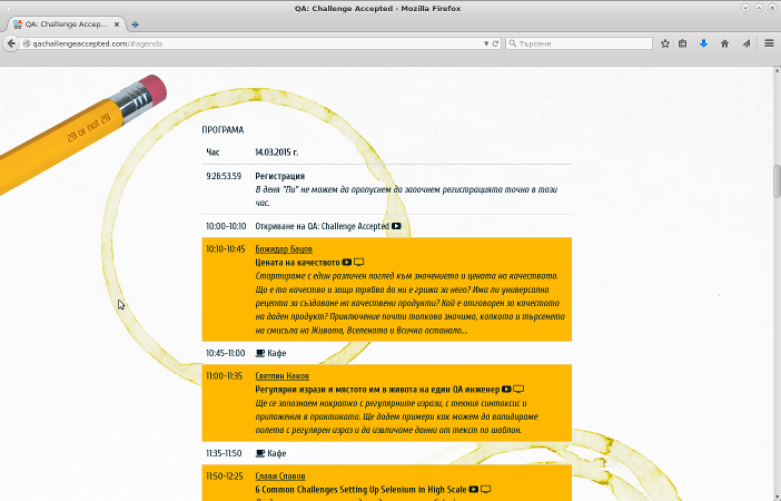
Today I wanted to submit a presentation proposal for QA Challenge Accepted 2016 and found a usability problem in their website. The first picture is how the UI looks on my screen. As you can see the screen height is enough to show the first section of the interface. There's something orange at the bottom which isn't clearly identifiable. The next picture shows the UI as it looks after clicking on the PROGRAM menu link.

The problem is that I never saw the orange section, which turned out to be the call for papers and a link to the submission form. To fix this the orange section either needs to go at the top and be clearly visible or at least a new item be added to the menu.
Btw the next event will be in March 2016 in Sofia and I hope to see you there!
Comments !