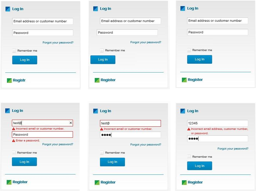
How do you test a login form? is one of my favorite questions when screening candidates for QA positions and also a good brain exercise even for experienced testers. I've written about it last year. In this blog post I'd like to share a different perspective on this same question, this time courtesy of my friend Rayna Stankova.

What bugs do you see above
The series of images above is from a Women Who Code Sofia workshop where the participants were given printed copies and asked to find as much defects as possible. Here they are (counting clock-wise from the top-left corner):
- Typo in "Registr" link at the bottom;
- UI components are not aligned;
- Missing "Forgot your password?" link
- Backend credentials validation with empty password; plain text password field; Too specific information about incorrect credentials;
- Too specific information about incorrect credentials with visual hint as to what exactly is not correct. In this case it looks like the password is OK, maybe it was one of the 4 most commonly used passwords, but the username is wrong which we can easily figure out;
- In this case the error handling appears to be correct, not disclosing what exactly is wrong. The placement is somewhat wrong, it looks like an error message for one of the fields instead for the entire form. I'd move that to the top and even slightly update the wording to be more like Login failed, bad credentials, try again.
How do you test this
Here is a list of possible test scenarios, proposed by Rayna. Notes are mine.
UI Layer
- Test 1: Verify Email (User ID) field has focus on page load
- Test 2: Verify Empty Email (User ID) field and Password field
- Test 3: Verify Empty Email (User ID) field
- Test 4: Verify Empty Password field
- Test 5: Verify Correct sign in
- Test 6: Verify Incorrect sign in
- Test 7: Verify Password Reset - working link
- Test 8: Verify Password Reset - invalid emails
- Test 9: Verify Password Reset - valid email
- Test 10: Verify Password Reset - using new password
- Test 11: Verify Password Reset - using old password
- Test 12: Verify whether password text is hidden
- Test 13: Verify text field limits - whether the browser accepts more than the allowed database limits
- Test 14: Verify that validation message is displayed in case user exceeds the character limit of the username and password fields
- Test 15: Verify if there is checkbox with label "remember password" in the login page
- Test 16: Verify if it’s allowed the username to contain non printable characters? If not, this is invalid on the 'create user' section.
- Test 17: Verify if the user must be logged in to access any other area of the site.
Tests 10 and 11 are particularly relevant for Fedora Account System where you need a really strong password and (at least in the past) had to change it more often and couldn't reuse any of your old passwords. As a user I really hate this b/c I can't remember my own password but it makes for a good test scenario.
13 and 14 are also something I rarely see and could make a nice case for property based testing.
16 would have been the bread and butter of testing Emoj.li (the first emoji-only social network).
Keyboard Specific
- Test 18: Verify Navigate to all fields
- Test 19: Verify Enter submits on password focus
- Test 20: Verify Space submits on login focus
- Test 21: Verify Enter submits
These are all so relevant with beautifully styled websites nowadays. The one I hate the most is when space key doesn't trigger select/unselect for checkboxes which are actually images!
Security:
- Test 22: Verify SQL Injections testing - password field
- Test 23: Verify SQL Injections testing - username field
- Test 24: Verify SQL Injections testing - reset password
- Test 25: Verify Password/username not visible from URL login
- Test 26: Verify For security point of view, in case of incorrect credentials user is displayed the message like "incorrect username or password" instead of exact message pointing at the field that is incorrect. As message like "incorrect username" will aid hacker in brute-forcing the fields one by one
- Test 27: Verify the timeout of the login session
- Test 28: Verify if the password can be copy-pasted or not
- Test 29: Verify that once logged in, clicking back button doesn't logout user
22, 23 and 24 are a bit generic and I guess can be collapsed into one. Better yet make them more specific instead.
Test 28 may sound like nonsense but is not. I remember back in the days that it was possible to copy and paste the password out of Windows dial-up credentials screen. With heavily styled form fields it is possible to have this problem again so it is a valid check IMO.
Others:
- Test 30: Verify that the password is in encrypted form when entered
- Test 31: Verify the user must be logged in to call any web services.
- Test 32: Verify if the username is allowed to contain non printable characters, the code handling login can deal with them and no error is thrown.
I think Test 30 means to validate that the backend doesn't store passwords in plain text but rather stores their hashes.
32 is a duplicate of 16. I also say why only the username? Password field is also a good candidate for this.
If you check how I would test a login form you will find some similarities but there are also scenarios which are different. I'm interested to see what other scenarios we've both missed, especially ones which have manifested themselves as bugs in actual applications.
Thanks for reading and happy testing!
Comments !