Design is a method! Design can be taught! Developers can do good design! If this sounds outrageous then I present you Zaharenia Atzitzikaki who is a developer by education, not a graphics designer and she thinks otherwise. This blog post will summarize her workshop held at the DEVit conference last month.
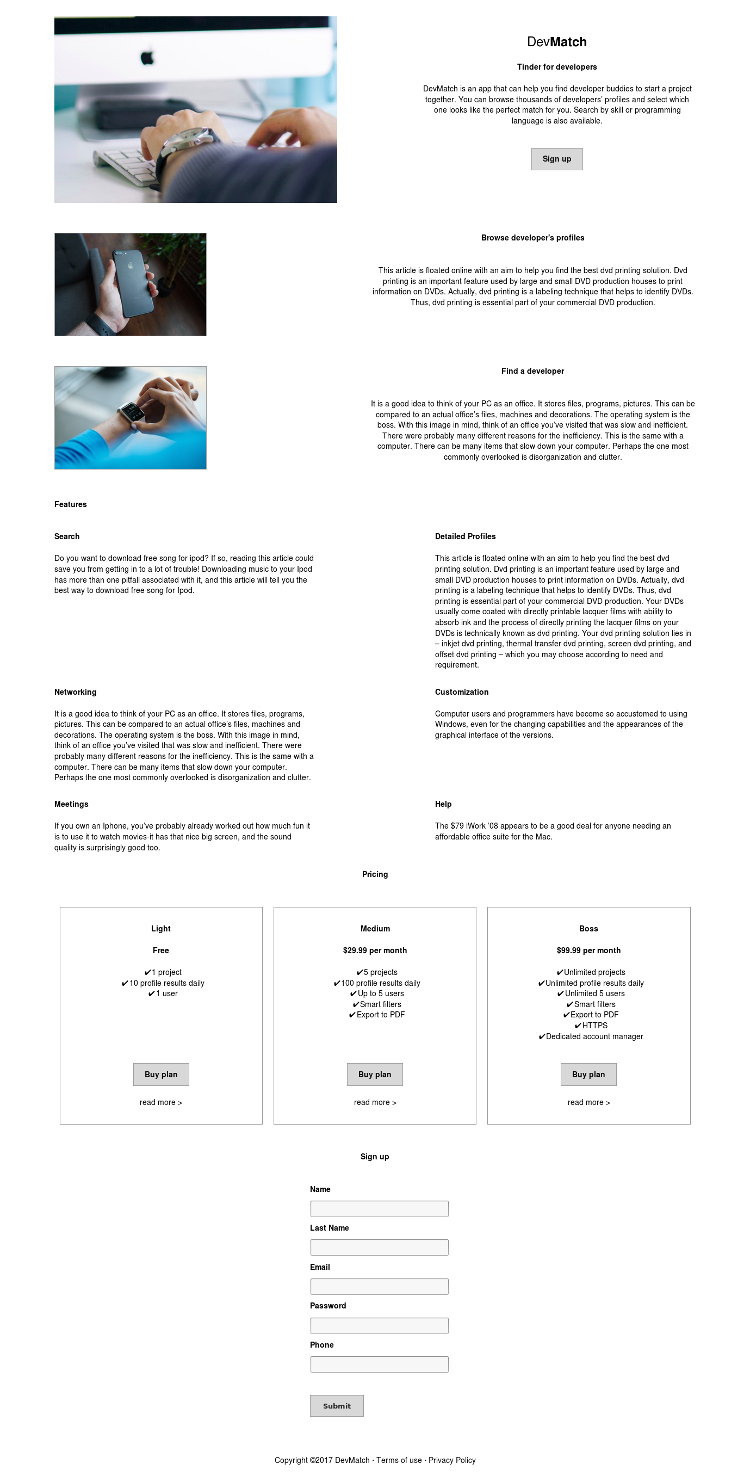
We are going to build a site called DevMatch, which is like Tinder for
developers. The initial version doesn't look bad but we can do better:
Step 1: Layout
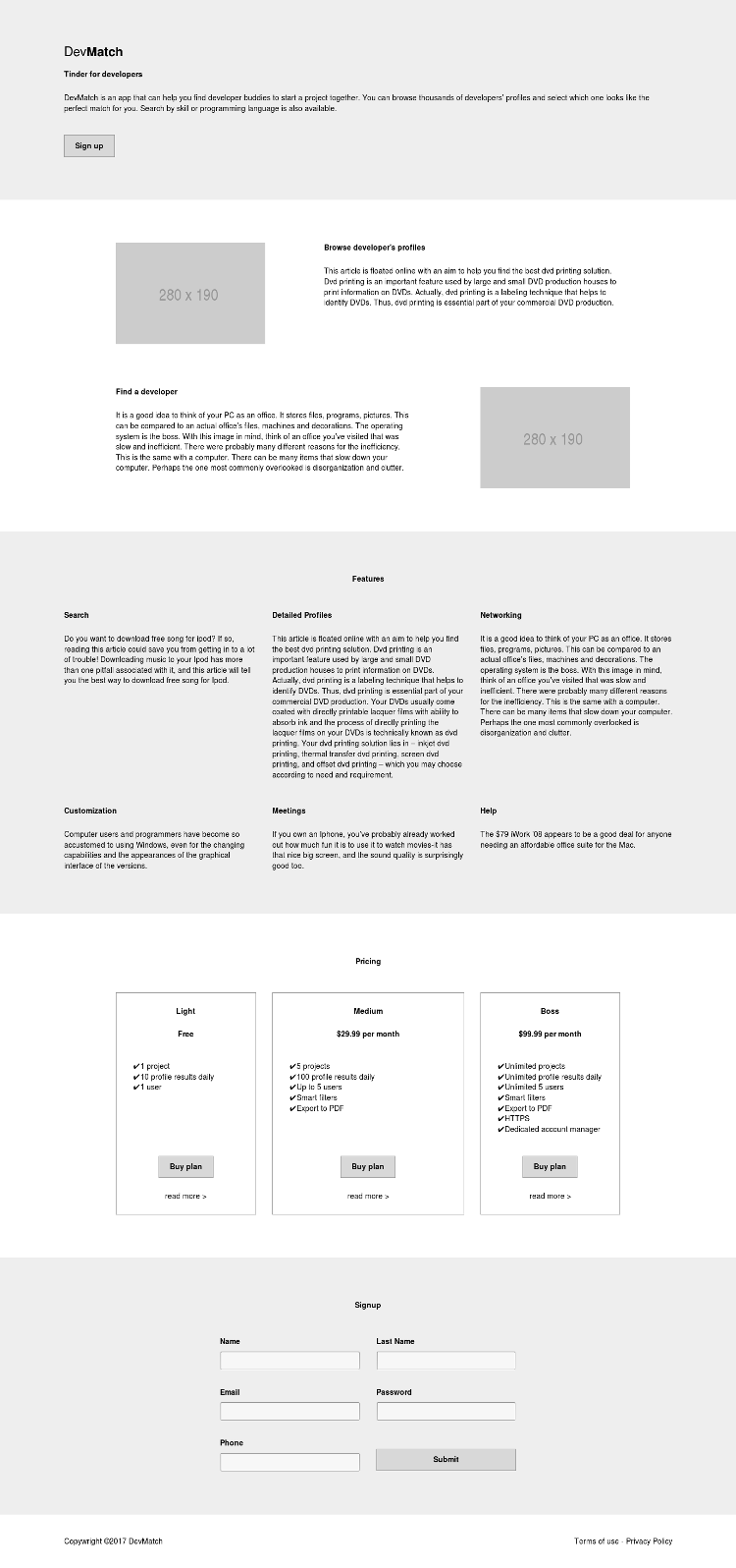
Layout is grids and the most popular designs use grids with 12, 16 or 24 columns. The idea is to make everything align to the grid which allows the eyes to follow a straight line and makes the content easier to perceive. You don't want to break the story line. Don't fear the white space but don't leave it random.
Make everything align to the grid ... but not so much (checkout this TEDx talk about predictability and variability in music).
Make sure not to use centered alignment, nor justified alignment because they don't provide a single line for the eyes to follow. Align to the left, buttons align at the bottom.
To make an element more prominent (like the recommended plan) then make it double width!
Finally we remove the stock images because they are distracting!
Here's how everything looks now:
Step 2: Typography
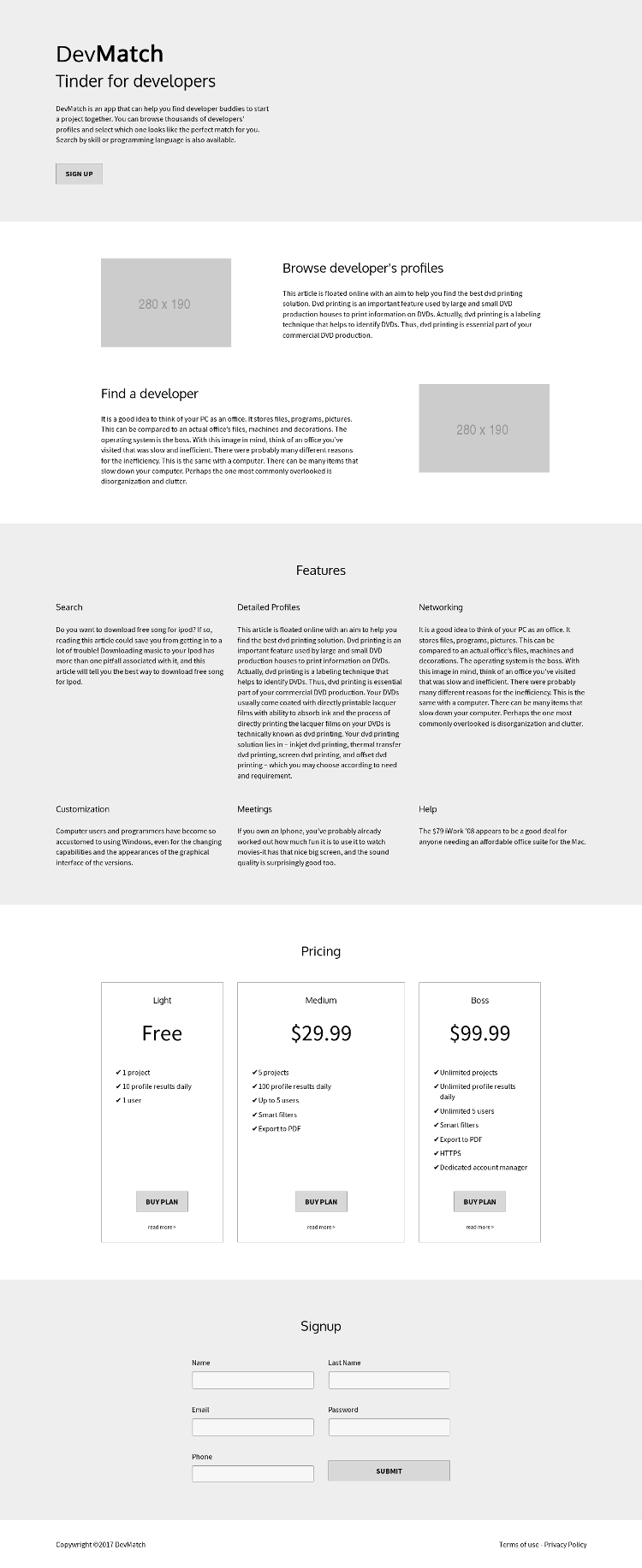
The web is 95% typography. Serif fonts are good for reading long passages of text because they allow the eyes to follow. Sans-serif fonts look great on screens, especially for smaller sizes (< 12px). Monospaced fonts are only for code! Script fonts are fun but use them with caution.
The fonts we select need to improve readability, not hinder it. Minimum font size should be 16px or even 18px.
Use a typographic scale which tells you how big certain text should be, e.g. h1 vs h2 vs h3 vs paragraph!
Find a font pair which works (e.g. Oxygen + Source Sans). Also compile a list of fallback fonts, e.g. Futura, Trebuchet MS, Arial, Sans-serif. This makes sure that your fonts work well together and that visitors on your site will use fonts which are as close as possible to what you intended.
Increase line height to improve readability of paragraphs. The minimum is 1.4em. Keep line length short, between 45 and 75 characters.
Layout and Typography are the two most important design steps and you will
achieve very good results if you apply only the two of them.
Here's how everything looks now:
Step 3: Color
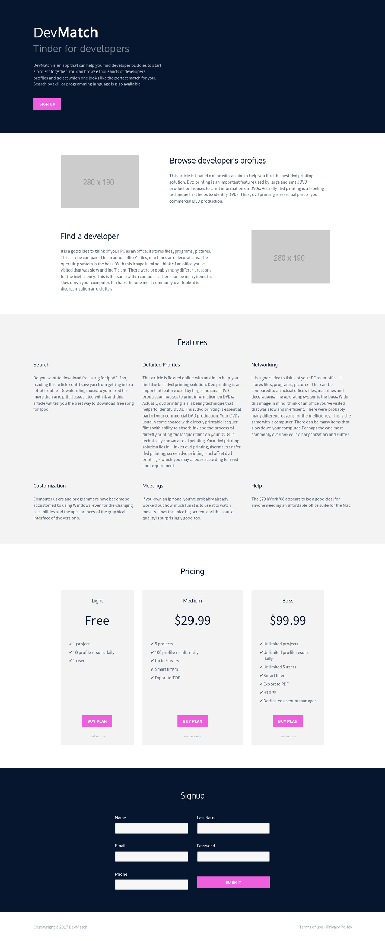
Find a color palette generator and use it. For new projects start with competitor analysis, a logo or a picture you like or something that conveys a known meaning to the customer. Zaharenia's tips include:
- Avoid clear black and clear white because they are not easy to read. Use a gray-scale shade or change the transparency channel to get a new color;
- Success is GREEN;
- Error is RED. Don't use red color for normal text;
- Don't rely on color alone because some people may be color blind, others may be using a gray scale (or a bad quality) screen, etc.;
- For links use underlines;
- For background use the brand color - this is the most visible color;
- Use an accent color. This is the most striking color (purple in this example) but use it sparingly, only for buttons or important items;
- We need a light background color as well;
- Need dark text color, but not black;
- Need link color;
Here's how everything looks now:
Step 4: Visual elements
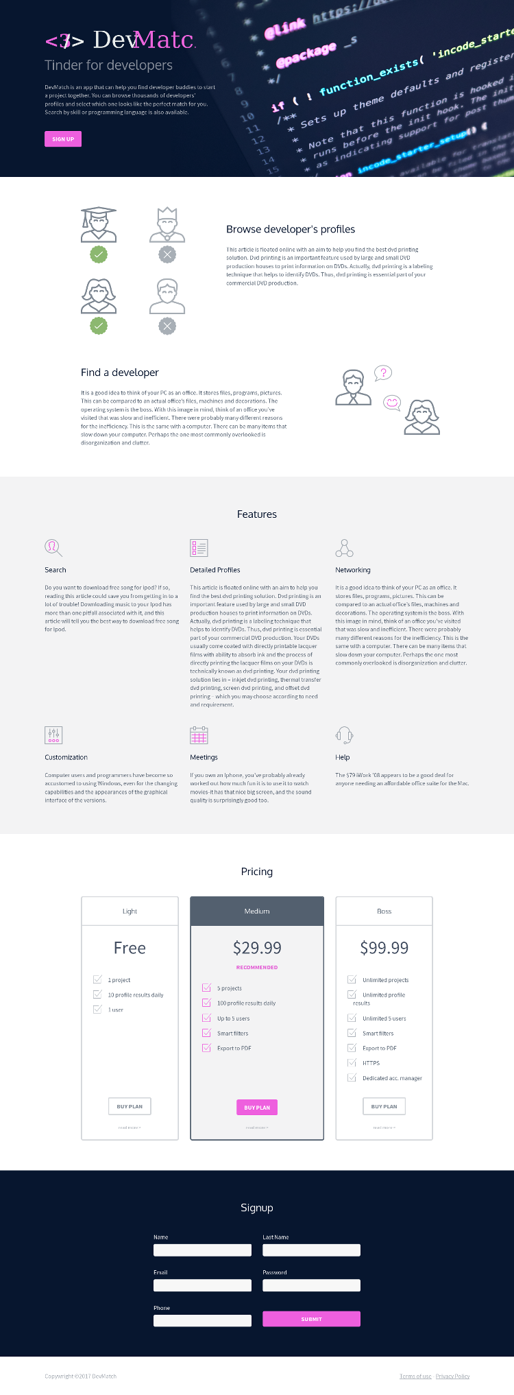
Here we talk about icons and images which are to be used only as visual aid, not alone (especially for navigation). The best thing you can do is find a good icon set (with lots of sizes) or even better an SVG set. Then combine several icons together if need be, instead of using stock photos.
It is best to use SVG for all icons because we can use CSS to modify the colors
inside the SVG. For example the features icons below are all gray and some SVG paths
have been styled with the accent color. Here's how it looks now:
Other tips include
- Use logo and header images for the headers;
- To make element pop add border, add header, add accent color in the middle (e.g. the pricing section).
Step 5: Copyright
This is about what text we provide on the screen. The rules of thumb are:
- People scan, they don't read;
- Aim for clarity;
- Avoid industry/technical slang;
- Keep lines short: 45 to 75 characters;
- Write clear error messages and clear call to actions. Repeat the actual verb in the call to action and be more verbose. E.g. Yes, delete this or No, I changed my mind. Instead of Submit use Create account;
- Truncate your text: cut in half and then again;
- Design your text to be roughly even which helps with alignment but don't over do it;
- Keep forms very short
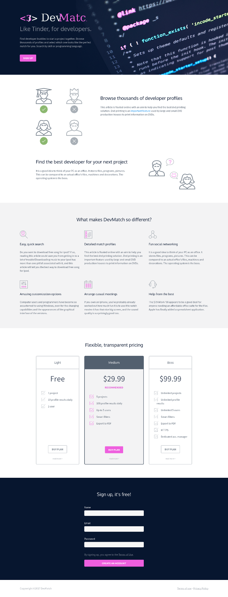
And this is the final version of our website (note: the header logo mishap
is probably from my side, not intentional):
These are the 5 basic design steps. You don't need to be a trained designer to be able to apply them. Now that you know what the steps are simply search for fonts, scales, color palettes and icon sets and apply them. This is what Zaharenia does (in her own words). You can find all HTML, CSS and images for this workshop at the design4devs-devit repository.
Thanks for reading and happy designing!
Comments !